12 Mar The Psychology of Colors in Branding

The famed jazz musician Louis Armstrong once sang about “skies of blue and clouds of white…what a wonderful world!”
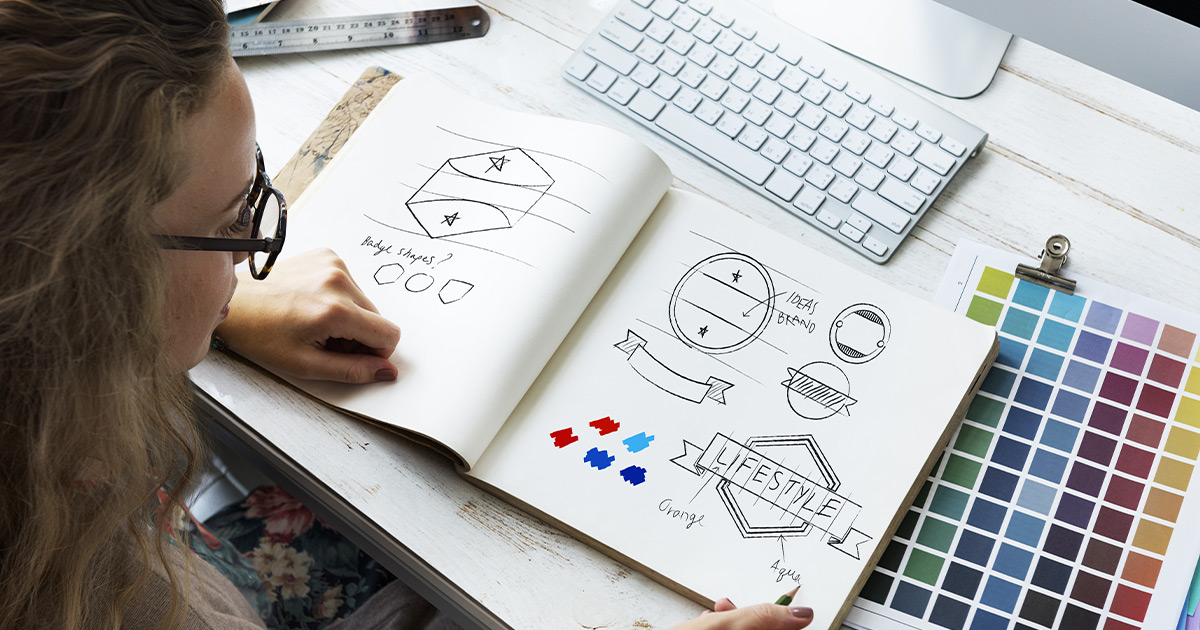
Color is everywhere and whether we’re consciously aware of it or not, colors and emotions are naturally linked. This link plays a significant role in brand perception and a consumer’s brand connections. That’s why an understanding of the psychology of colors is a valuable asset for designers tasked with selecting branding colors, and creating a distinctive, relatable brand presence.

What is the Psychology of Colors?
The psychology of colors is the study of color as a determinant of human behavior. It’s an essential consideration when it comes to creating and marketing a brand, since colors subconsciously influence consumer emotions and their perception of goods and services.
It can even motivate or deter a purchase.
Although the power of the perfect hue can’t be denied, color symbolism and meanings also differ from person to person depending on individuals’ gender, age, location, values and other variables.
Color Symbolism and Meanings
It’s universally acknowledged that different colors evoke different emotions. Soft blues and greens are typically associated with feelings of calm and tranquility, and may be used to create a “coastal” palette.
On the other hand, vibrant reds and oranges may be used to stimulate a consumer’s interest and encourage spontaneity, as with a “clearance” sign in a retail window display.
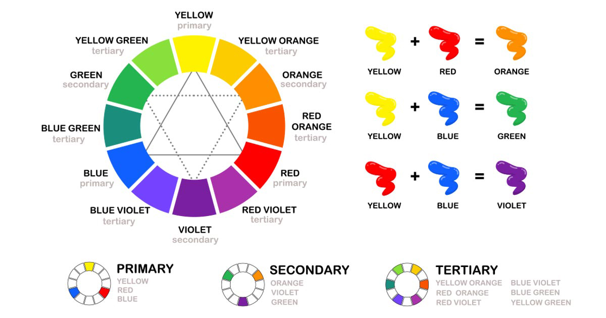
The color symbolism and meanings for popular hues are outlined below. These colors can also be saturated, darkened or blended to inspire a greater variety of emotions.
Red
Red is a bright, warm color that excites and incites consumers to act. It’s an intense color typically associated with strong emotions of love, passion, power and anger.
Pink
Pink is traditionally considered “feminine,” and as a result it’s typically associated with love, romance and vulnerability. However, different shades of pink may also be used to evoke a sense of sophistication.
The popularity of ‘rose gold’ and ‘millennial pink’ are two examples of this color’s evolving connection to luxury branding.
Yellow
Yellow is the brightest color of the visible spectrum, and is linked to increased attention and feelings of cheerfulness, warmth and energy. This color also places the most strain on the eye, so should be used selectively in branding and marketing.
Blue
Blue is one of the most popular and versatile branding colors. Light blue is often linked to creativity, sky blue is linked to relaxation, and dark blue is associated with intelligence.
Overall, blue radiates an aura of trust and dependability, and is often linked with innovation.
Green
Green is a cool, refreshing color that evokes strong associations with nature and the natural world. This natural link ties the color back into feelings of tranquility, health and stress relief.
Purple
Purple is a beautifully balanced blend of blue’s stability and red’s vibrancy, and is usually connected to luxury, power, wisdom and creativity. It isn’t used as often as other branding colors, but it stands out all the more because of it.
As with other colors, different shades have different connotations. In centuries past, rich purple hues were reserved for nobility, hence its modern association with power and luxury. Lighter, more vibrant purples like those seen in Yahoo’s logo or the Lifetime movie channel logo are associated with creativity or femininity.
Much like color, human psychology is a broad spectrum. For example, a middle-class 26-year-old man might perceive a red in-store display differently than a wealthy 64-year-old woman. Depending on demographics, color selection and subsequent brand perception may vary.
Branding and Marketing Colors
Color’s profound influence on branding and marketing cannot be denied, and trends are unmistakable. That’s why the Pantone Color Institute has been choosing a Color of the Year since 2000, establishing trends that are used throughout the branding, marketing and creative industries.
The color of 2020 is Classic Blue, an “enduring blue hue” that instills “calm, confidence and connection,” and we wouldn’t be surprised if it shows up more than ever in the months to come! Our own website was inspired by this color of the year, and our team is always up to date on the best branding trends and best practices.
When it comes to establishing a brand personality and choosing branding colors, designers should ask themselves a series of questions:
• Will the brand be perceived as more masculine or feminine?
• Is the brand luxurious or affordable?
• Is the brand fresh and youthful, or established and mature?
• Is the brand timeless and classic, or cool and contemporary?
Answering and understanding these questions will help guide a creative team’s selection of marketing colors.

Leading the Way in Brand-Building for 35 Years
ULA is a premier real estate and lifestyle marketing agency, with 35 years of experience ensuring client success and delivering results that transform city skylines and exceed expectations. The creative experts at United Landmark Associates are always ready to leverage their industry knowledge to create and relaunch inspiring, innovative brands – contact us online or call 813-870-9519 for more information.